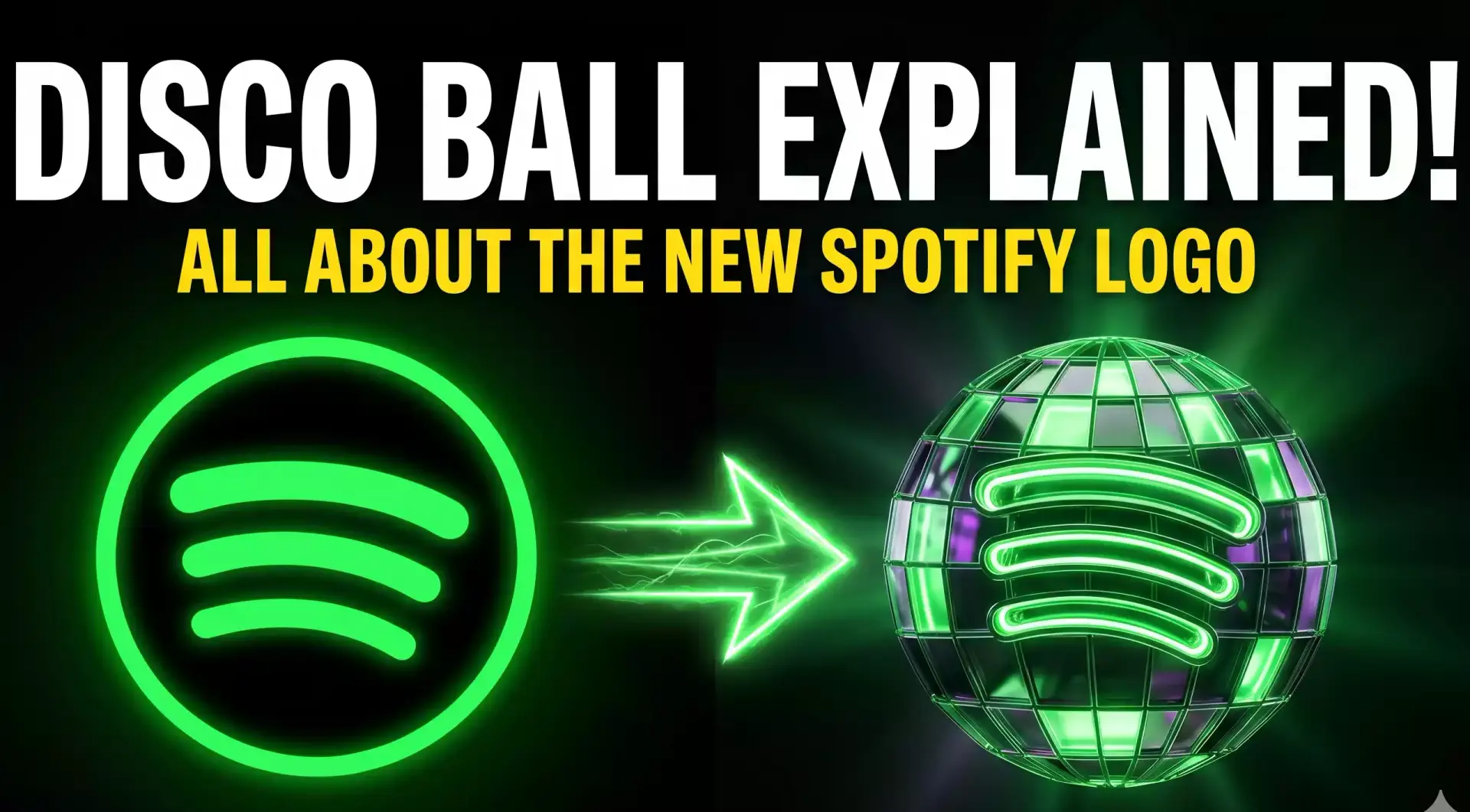
The new Spotify logo has officially arrived, trading the platform’s famously flat green circle for a dazzling, glittering green disco ball. This unexpected design shift has sparked massive curiosity, viral social media threads, and a fair share of confusion. Whether you love the fresh, party-ready vibe or you initially mistook it for a visual glitch, there is a very specific reason behind the sudden makeover.
Here is the complete guide to understanding the new Spotify logo, the story behind the shimmering disco ball, and what it means for your daily listening experience.
What Exactly is the New Spotify Logo?
Rolled out globally to iOS and Android devices in mid-May 2026, the updated app icon replaces the platform’s classic, minimalist aesthetic. While it retains the iconic neon green background and the three recognizable black sound waves, the surrounding circle has been transformed into a faceted, 3D mirrored sphere.
This disco ball design is intentionally bright, campy, and highly textured. By reflecting “light” in multiple directions, the icon aims to represent the diverse, millions-strong global community of listeners who interact with the app every single day.
Why Did Spotify Change Its App Icon?
Whenever a massive tech giant tweaks its branding, users naturally wonder if it signals a massive corporate overhaul. The reality behind this specific update is much more celebratory.
The disco ball icon was introduced to mark Spotify’s 20th Anniversary. Founded in April 2006 by Daniel Ek and Martin Lorentzon, the streaming pioneer is celebrating two decades of shaping modern music culture. Rather than rolling out a standard corporate milestone announcement, Spotify decided to turn the spotlight onto its users.
The new Spotify logo serves as the visual centerpiece for a massive global campaign titled “Spotify 20: Your Party of the Year(s).” According to the company’s marketing executives, the disco ball represents:
- Celebration & Nightlife: A nod to the unifying power of music and dance.
- Fandom & Community: Reflecting the countless individual listening journeys that make up the platform’s shared culture.
- Nostalgia: A throwback aesthetic to match a campaign heavily focused on user history.
Is the Disco Ball Logo Permanent?
If you are a fan of the classic, clean design, you can breathe a sigh of relief. The new Spotify logo is not a permanent rebrand.
Company moderators and support channels have confirmed that this is a temporary, limited-time “skin” designed specifically for the anniversary event. Just as other popular apps temporarily adopt themed icons for holidays or special events, Spotify’s disco ball is a festive, commemorative edition. Once the “Spotify 20” campaign concludes, the icon is expected to revert to the familiar green aesthetic you know and love.
User Reactions: Love It or Hate It?
As with any major design update, the internet’s reaction to the new Spotify logo has been swift and deeply polarized. Social media platforms like X (formerly Twitter), Threads, and Reddit have been flooded with opinions.
The Critics
Many users were initially thrown off by the high-texture design.
- The “Glitch” Effect: Several users admitted they thought their phone screen was dirty or that the app was glitching during an update.
- Design Purists: On graphic design forums, critics have called the 3D aesthetic “disorienting” and harder to parse at a quick glance compared to the standard flat design.
The Fans
Conversely, a vocal segment of users has embraced the campy aesthetic.
- Anti-Sterile Design: Many listeners are praising the brand for stepping away from the “cold, data-driven” minimalism that dominates modern app design, favoring the “weird and fun” vibes of the disco ball.
- Party Mode: Fans of the temporary update appreciate the lighthearted, birthday-party energy it brings to their home screens.
Beyond the Logo: Unlocking “Party of the Year(s)”
The most exciting part of the new Spotify logo rollout isn’t just the visual change—it is the incredible new feature attached to it. The “Spotify 20” anniversary brings an in-app experience that goes far beyond the annual Wrapped summaries.
“Party of the Year(s)” is a massive, personalized time capsule that tracks your entire listening history from the very first day you created your account.
By searching for “Spotify 20” or tapping the anniversary banner in the mobile app, you can unlock nostalgic, shareable data cards revealing:
- Your Account Birthday: The exact date you first joined the platform.
- Your First Stream: The very first song you ever played.
- Total Unique Tracks: The staggering number of individual songs you have explored over the years.
- All-Time Top Artist: Your ultimate, most-streamed musician.
To top it all off, Spotify generates a custom All-Time Top 120 Playlist, gathering your most heavily rotated tracks from your entire history on the app, complete with your exact play counts.
Final Thoughts
The new Spotify logo might be a temporary visitor on your smartphone, but it marks a massive milestone in streaming history. While the glittering green disco ball has certainly divided the internet, it serves as a fun, nostalgic invitation to look back at the soundtrack of your life over the past twenty years. So, before the classic icon returns, dive into your app, explore your “Party of the Year(s)” stats, and enjoy the celebration.
1 thought on “Everything You Need to Know About the New Spotify Logo: The Disco Ball Explained 2026<span class="badge-status" style="background:#ff0000">NEW</span> ”